Relief from the Audio Interface Blues: Expanding the Spectrum of Menu, List, and Form
Styles
Paul Resnick
MIT Room E53-325
Cambridge, MA 02139
presnick@mit.edu
Robert A. Virzi
GTE Laboratories Incorporated
Waltham, MA 02251
rvirzi@gte.com
Menus, lists, and forms are the workhorse dialogue structures in telephone-based
interactive voice response applications. Despite diversity in applications, there is a
surprising homogeneity in the menu, list, and form styles commonly employed. There are,
however, many alternatives, and no single style fits every prospective application and
user population. A design space for each dialogue structure organizes the alternatives and
provides a framework for analyzing their benefits and drawbacks. In addition to phone
based interactions, the design spaces apply to any limited bandwidth, temporally
constrained display devices, including small screen devices such as Personal Digital
Assistants (PDAs) and screen phones.
Categories and Subject Descriptors: H.5.1 [Information Interfaces and Presentation]
Multimedia Information Systems-Audio input/output; H.5.2 [Information Interfaces and
Presentation] User Interfaces-Interaction Styles (e.g., commands, menus, forms, direct
manipulation) .
General Terms: Human Factors
Additional Key Words and Phrases: Menus, Forms, Interactive voice response (IVR), Voice
mail, PDA, ADSI, Skip and Scan.
Digital storage and processing of audio have opened new possibilities for speech-based
applications. There is already a large and growing market for telephone-based voice mail
and interactive voice response services. With the arrival of personal digital assistants
and the integration of audio into desktop computing, speech is also likely to gain
importance for eyes-busy applications, for personal communications, and for records of
conversations.
Compared to visual presentation of information, speech output is slow, serial, and
provides no short term memory aids [Schmandt 1994; Halstead-Nussloch 1989]. Good readers
can read faster than they can listen.
Two technologies are available, however, that can aid listeners. The first is to play
speech back faster than it was recorded. An increasing number of voice mail systems offer
accelerated playback, usually without pitch distortion. Some digital signal processing
mechanisms allow a factor of two speedup while still retaining intelligibility [Arons
1992; Kato & Hosoya 1993].
The second, and more important technology, is random access. It takes time to fast
forward a conventional audio cassette tape, but it takes virtually no time to jump to a
different part of a digitally stored recording. Meaningful subdivision of recordings,
together with user control over jumps between those parts, allows listeners to skip some
parts of a recording entirely. Elsewhere, we have described as skip and scan those
audio interfaces that allow users to scan a recording by skipping frequently [Resnick
& Virzi 1992; Virzi, et al. 1992]. [Arons 1993] explores playback controls that affect
both speed of playback and skips between segments.
To exploit random access, a designer needs to identify meaningful segments in
recordings. One source of segmentation is pre-defined structure, such as the separate
entry blanks in a form. The person recording can also indicate segment boundaries [Gould
& Boies 1983; Degen, et al. 1992; Stifelman, et al. 1993]. In some cases, a computer
can infer segments after the fact from acoustic properties of a recording, such as turn
taking between speakers [Hindus & Schmandt 1993].
This article describes what user control, through random access, can do for three
common audio dialogue structures, menus, lists, and forms. A menu presents a sequence of
items and allows a user to select one. More generally, a list presents a sequence of items
and allows zero, one, or more selections. In some cases, users may also add and remove
items from lists and menus. A form allows entry of a collection of related pieces of
information. Audio menus, lists, and forms present options and instructions through spoken
voice and allow user input either through buttons or speech.
Many menu, list, and form styles are possible. There is a surprising lack of diversity,
however, in the styles commonly employed, and the most common styles offer limited user
control. One goal of this paper is to highlight some of the interesting alternatives that
are available.
There are too many styles, however, to present them exhaustively. Instead, four
dimensions define design spaces for menus, lists, and forms. Mixing and matching choices
on these dimensions can generate the currently popular styles, the alternatives described
in this paper, and others yet to be invented.
The design spaces specify dialogue styles from the system's perspective: when to play
which recordings and how to respond to input. We also consider the user's perspective: the
sound and feel. Eight design considerations discuss the effect of choices on individual
dimensions of the design space or the effects of prompt wording. Many of the design
considerations involve tradeoffs between serving people who will interact with a system
only once, those who are interacting for the first of many times, and those who are
already experts.
All our examples assume interaction over a telephone. The analysis applies, however, to
any audio presentation of menus and forms, over the phone or with some other device such
as a Personal Digital Assistant. As we will argue in the conclusion, the analysis is even
relevant to limited bandwidth visual output devices, such as 20 character by two-line
LCDs, since such devices have the same temporal presentation constraint as audio output.
The critical factor that distinguishes our analysis from analyses of most visual menus
and forms is the temporal presentation of information. Some analyses of visual menus
assume that users consider the options one at a time [Lee & MacGregor 1985; Paap &
Roske-Hofstrand 1986], while others assume a more flexible process [Card 1982; Landauer
& Nachbar 1985], leading to different conclusions about the optimal breadth or depth
of menu hierarchies [Miller 1981; Kiger 1984]. [Norman 1991] summarizes much of this
literature. All of these analyses, however, assume simultaneous presentation of the entire
menu: a user shifts attention between items by shifting eye gaze.
Two experiments explored visual menu styles that were artificially restricted to
temporal presentation of items [MacGregor, et al. 1986; Pierce, et al. 1992]. The screen
displayed only one menu item at a time; users controlled when to move to the next item
with keypad input. The models of human search processes developed from those experiments
will likely apply to some audio menu styles but not others because not all audio menu
styles give users control over when to hear the next item.
Our examples all assume touch-tones for input, with the buttons referred to by number
(0-9) or symbol (* and #). Keys could also be labeled by letters, however, so that users
could enter a letter sequence or word [Fast & Ballantine 1988; Marics 1990; Detweiler,
et al. 1990; Davis 1991] to initiate actions. Buttons on a hand-held device would lead to
similar interactions.
We briefly mention input by speech recognition in those situations where it could offer
significant advantages over buttons. [Fay 1994] provides a cogent discussion of when users
may prefer touchtone to speech input, or vice versa, but such issues are largely
independent of the issues in this article. Speech entry of commands would be useful, but
would not eliminate the need to present lists and even menus on occasion, as explored in
[Hornstein 1994]. Similarly, speech entry of data in entry blanks of an audio form would
still leave the need for navigation among the entry blanks. In short, speech recognition
is an input technique while this paper addresses user control over audio output.
The system perspective follows a traditional engineering approach. Divide a dialogue
mechanism into its constituent parts and recombine the parts in novel ways. In this case,
there are two kinds of constituent parts. The first are voice recordings. The second are
state-change actions such as marking a particular item in a menu or adding a value to a
particular entry blank in a form. The division of the recordings into smaller parts also
introduces opportunities for movement actions that allow users to stop hearing one part
and start hearing another. Finally, the designer can choose what effect user inaction, a
timeout, will have.
We introduce this idea by applying it to audio menus. First we present the standard
menu style, which treats the entire menu as a single recording. Breaking it into separate
parts (recordings) for the header, menu items, and footer leads to interesting alternative
styles. We then define a design space of possible menu (and list) styles and exhaustively
map a restricted subset. Section 4 will illustrate but not exhaust the rest of the space,
and then recursively apply the technique to yield a design space for presenting individual
menu (and list) items. Section 5 will generate alternative form styles through the same
technique of subdivision and recombination.
The predominant implementation of audio menus currently is as a single recording that
describes all the options. Any time during playback of the recording, a caller can press a
number associated with an option to select it. Example 1 presents a sample interaction
with such a menu.
The standard style can also be implemented with separate recordings for an introductory
header, descriptions of each of the menu items, and a concluding footer. Other divisions
are possible, but this one seems particularly natural. The system begins by playing the
first part, the header. If the user does nothing, the system automatically transitions to
the description of the first option, then the second, and so on. At any time, the user can
press a numbered button to select any of the options. Moreover, there is nothing else the
user can do but wait or select. There is no way, for example, to jump from the header to
the description of the last option. Figure 1 summarizes this implementation of the
standard menu style in a notation that we use throughout the paper.
 Welcome to the ABC Bank's Figure 1: The standard menu
bank-by-phone. For account style. Boxes indicate
balances, press 1; To transfer recordings. When the system
money between accounts, press 2; finishes playback of the
For mortgage rates, press 3. To recording in the current box,
open a new account, press 4. ^ it begins playing the box
This menu will now repeat. Make below it. Arrows inherit
your selection at any time. from the outside in. Thus,
[presses 4] Example 1: The the selection actions are
standard menu style. System available everywhere, even
prompts appear in plain text, though they are shown only
while user actions are bracketed. once for the enclosing box.
The caret symbol, ^, inserted in
the prompt, indicates timing of
the user's key press. That is,
the caller presses 4 before
hearing that the menu will repeat.
  Welcome to the ABC Bank's         Figure 1: The standard menu
bank-by-phone.  For account         style.  Boxes indicate
balances, press 1;  To transfer     recordings.  When the system
money between accounts, press 2;    finishes playback of the
For mortgage rates, press 3.  To    recording in the current box,
open a new account, press 4.  ^     it begins playing the box
This menu will now repeat.  Make    below it.  Arrows inherit
your selection at any time.         from the outside in.  Thus,
[presses 4]   Example 1: The        the selection actions are
standard menu style.  System        available everywhere, even
prompts appear in plain text,       though they are shown only
while user actions are bracketed.   once for the enclosing box.
The caret symbol, ^, inserted in
the prompt, indicates timing of
the user's key press.  That is,
the caller presses 4 before
hearing that the menu will repeat.
Dividing a recording would not be very interesting if it only led to duplication of the
original interaction style. Consider an alternative menu style, shown in Example 2. Since
it uses only two buttons, we call it and its variants 2-button styles. One button
advances to the next item. The user can interrupt playback of the current item by pressing
it. The other button selects the current item. As we discuss in section 3, this style has
quite different usability characteristics than the standard style. In particular, users,
by frequently skipping, can scan through the options faster.
 Welcome to XYZBank's bank-by-phone. Figure 2: The 2-button menu style.
To hear the first option, press 3. When there is no adjacent box, it
^ [presses 3] Account balances. To replays the contents of the current
select this option, press 1. For the box. That is, the current item will
next option, press 3. ^ [presses 3] keep replaying until the user presses
Transfers between ^ accounts. To a button.
select this option, press 1. For the
next option, press 3. [presses 3,
interrupting prompt] Mortgage rates.
^ To select this option...
[presses 3, interrupting again] Open
a new account. ^ To select this
option, press 1. [presses 1,
interrupting again] Example 2: A
sample 2-button menu dialogue.
  Welcome to XYZBank's bank-by-phone.    Figure 2: The 2-button menu style.
To hear the first option, press 3.      When there is no adjacent box, it
^  [presses 3] Account balances.  To    replays the contents of the current
select this option, press 1.  For the   box.  That is, the current item will
next option, press 3.  ^  [presses 3]   keep replaying until the user presses
Transfers between ^ accounts.  To       a button.
select this option, press 1.  For the
next option, press 3.  [presses 3,
interrupting prompt]  Mortgage rates.
^  To select this option...
[presses 3, interrupting again]  Open
a new account.  ^  To select this
option, press 1.  [presses 1,
interrupting again]   Example 2: A
sample 2-button menu dialogue.
Given the subdivision of menus into separate recordings for the header, each menu item,
and the footer, many more styles can be generated. Each style is defined by choices on
four dimensions: 1) user-initiated actions for movements between parts; 2) state change
actions; 3) actions that combine movement and state change; and 4) the effect of user
inaction, a timeout, from each part of the menu.
Figure 3 summarizes the design choices that define the standard and 2-button styles.
The standard style does not let users move between options at will, while the 2-button
style provides a button to skip to the next option. The standard style employs absolute
selection: pressing a numbered button anywhere in the menu selects the corresponding item.
The 2-button style employs position-sensitive selection: a user can select only the
current item. In both styles, a select action marks an item and also terminates
interaction with the menu. Neither style employs actions that combine movement and state
change. Finally, a timeout in the standard style causes an automatic advance to the next
option, while in the 2-button style it causes repetition of the current item.
Design Dimension     Standard Style          2-Button Style
Movement actions     --                      next
State change         select (absolute) +     select (current) +
actions              terminate               terminate
Action combinations  --                      --
User Inaction        move to next recording  repeat current
Effect
Figure 3: The standard and 2-button styles as points in the design space.
Section 4 presents other possible choices on each of the four dimensions and
illustrates them with additional menu and list styles. Here we explore exhaustively only
the subspace defined by combinations of the choices used in the standard and 2-button
styles. In Figure 4, the rows indicate three choices for advancing from one part to the
next: automatic (timeout) transitions, explicit user actions (i.e., a next, or skip key),
or both. The columns indicate the two choices for selecting items: absolute, where any
item can be selected from anywhere in the menu, and positional, where only the current
item can be selected.
The two styles above fill two of the cells. Absolute selection together with automatic
transitions between parts defines the standard menu style, the upper left cell. Positional
selection along with explicit transitions defines the 2-button style, the middle right
cell.
The other four cells mix and match these features. The temporal menu style [Schmandt
1994] uses only one button. The listener waits while the computer recites the options and
presses the select button upon hearing the desired option. The temporal-with-skips style
adds an explicit skip ahead button to temporal menus, so that a listener can either wait
through the recitation of the options, or press a button to skip through them. The standard-with-skips
style works just like standard menus, but provides in addition a button, say #, that a
listener can press any time to skip ahead to the next option. The stepped numeric
style removes the automatic advance, so that a listener can only move on to the next
option by pressing the skip key.
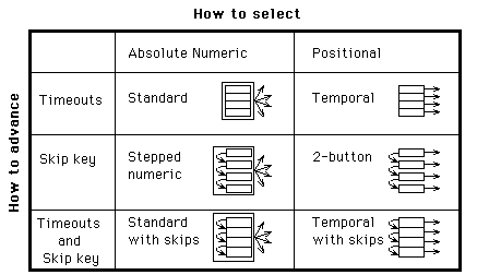
Figure 4: The menu style subspace defined by the dimensions of how users select
items and how they advance from one item to the next.
Any of the styles in the subspace above could be modified to use separate marking and
termination actions rather than a composite select-and-terminate action. To illustrate,
the positional multi-selector style is a variant on the 2-button style. Example 3
shows a sample interaction. Once a style allows selection of more than one option, it may
no longer be appropriate to think of it as a menu, but rather as a list. Section 4
discusses other list styles, including those that do not allow selection at all, and those
that include additional state-change actions such as adding and deleting items.
Now you need to select toppings for your pizza. You may choose as many toppings as you
like. To hear the first topping, press 3. ^
[presses 3]
Thinly sliced peperoni. To select this topping, press 1. For the next topping, press 3.
If you're done making selections, press #. ^
[presses 3]
Marinated ^ artichoke hearts. To select ...
[presses 1, interrupting prompt]
[Beep] Marinated artichoke hearts. To deselect, press 1. For the next topping, press 3.
^ If you're done...
[presses 3, interrupting prompt]
Black Italian olives. ^ To select ...
[presses 3, interrupting prompt]
Sliced Porcini mushrooms. ^ To select...
[presses 1, interrupting prompt]
[Beep] Sliced Porcini mushrooms. To deselect this option, press 1. For the next option,
press 3. If you're done making selections, press #.
[presses #]
Example 3: The positional multi-selector style. The beep indicates that an option is
marked for selection.
Design Dimension     Positional
                     multi-selector
Movement actions     next
State change         select(current)
actions              deselect(current)
                     terminate
Action combinations  --
User Inaction        repeat current
Effect
Figure 5: The positional multi-selector list style.
The system perspective defines a space of design choices by subdividing recordings and
actions and recombining them in novel ways. Each point in the space is defined by choices
of movement, state change, and combined actions, and the effect of timeouts. A design
space, however, merely identifies possibilities. To make appropriate choices, the designer
will need to consider the user perspective as well.
From the user's perspective, some system level choices make little difference while
others completely change the sound and feel of an interface. In addition, prompt wording
styles, which are immaterial from the system perspective, have a large impact from the
user perspective. We discuss how users' experience levels may affect those interactions
and then present general principles that relate system design choices and prompt wording
styles to their effects on user interactions.
Not all users are alike. They have different goals, so they choose different actions.
Moreover, they require different information to help them choose actions and figure out
how to execute them. For example, users who already know how to select an option do not
need to hear a prompt that says how to select it. It is the variation in user interests
and skills that makes user control so desirable.
Figure 6 shows a graph of user types, defined by two variables. The first variable is
users' familiarity with the mechanisms of the dialogue, how to initiate actions they have
decided to take. For example, users familiar with the 2-button menu style know which
button selects and which moves on to the next item. Such mechanism experts need no prompts
to tell them how to execute actions. The second variable is users' familiarity with the
contents of the dialogue, the information necessary to decide what action is appropriate.
For example, an astrology buff who calls a horoscope application may know the order of
presentation of the signs of the Zodiac without hearing them recited in a menu. Users who
are both mechanism and content experts (e.g., experienced users of a voice mail
application) may not need to hear any voice recordings at all because they know both what
actions are available and how to initiate them.

Figure 6. Four categories of users.
In general, repeated exposure will increase users' familiarity level with both the
contents and mechanisms of a dialogue, but mechanism expertise tends to develop more
rapidly. Regularities in the mechanism allow transfer of learning. For example, users of
2-button menus can predict the mechanism for selecting an option even if they have never
selected that particular option before.
A number of considerations govern how system level style choices will affect users with
varying levels of expertise. Some of the design considerations relate to choices on single
design dimensions, such as whether two actions should be bundled together as a single
composite action. Others focus on the interaction of possible design choices, such as
timeout movement to the next item combined with position sensitive selection. The final
two design considerations address the effect of prompt wording choices.
Where appropriate, we cite empirical evidence from two user tests, reported elsewhere,
that compared three menu styles [Resnick and Virzi 1992; Virzi, et al 1992]. Two were the
standard and standard-with-skips styles described above. The last was a variant of
2-button menus. It included a third button, to move back to the previous item. Since users
almost never pressed it, we describe the experimental results as if 2-button menus had
been used.
DC1: Separate -> flexible. A composite action is simpler for users, while
separate actions give them more flexibility.
The separation of selection from termination in a menu style permits users to make
multiple selections or to change their minds about a single selection. A user who wants to
select an option and then terminate can press two buttons in succession. This flexibility
comes at the cost of increased complexity: when the two actions are combined, a user need
learn only a single button.
DC2: Positional -> learnable. Positional actions are easier to learn
because they are independent of content.
The selection button is the same from any item in a 2-button menu, and from any item in
another 2-button menu as well. With the absolute selection actions in standard menus,
users need to learn more mappings of actions to buttons, since the selection button
changes from item to item.
In [Resnick and Virzi 1992], subjects interacted with the same application using either
two-button or standard-style menus. The two-button group was initially slower, but by the
sixth menu their performance was better than the standard-menus group. The second
experiment [Virzi, et al 1992] confirmed this result and demonstrated that subjects in the
two-button group easily transferred their knowledge of skipping to a new application.
This design consideration suggests an advantage for speech input over keypad input when
absolute actions are used. Command names may be easier to remember than button mappings.
That is important when absolute actions are used since there are many mappings to
remember. On the other hand, it takes longer to speak a command than press a single
button, so there is a tradeoff between ease of remembering speech commands and ease of
executing button presses.
DC3: Absolute -> executable. Absolute actions are easier to execute than
positional actions, once learned.
A user can type ahead a numeric menu selection with a single keystroke. Positional
selection requires several keystrokes or waiting until the appropriate menu item plays
back.
The first experiment [Resnick and Virzi 1992] provides no evidence for the hypothesis
that absolute actions are easier to execute, once learned, because subjects never
interacted with the same menu twice, hence had no chance to learn them.
Surprisingly, [Virzi, et al 1992] did not provide clear evidence, either. After
twenty-one exposures to the same menu tree, including three repetitions of a single task,
performance among the three menu styles tested was indistinguishable. Careful analysis of
the data logs indicates that standard-menu users typed ahead most but not all of their
menu selections. They were more likely to type ahead in the top menu of the tree. We
speculate that after even more practice, users would type ahead all of their selections,
and then the numeric selection styles would have better performance than the 2-button
style.
DC4: Timeout movement a crutch. Automatic transitions help mechanism novices,
but delay their acquisition of mechanism expertise.
A mechanism novice can hear all the parts more quickly if they are automatically played
in sequence than if the caller has to learn what buttons invoke explicit transitions. On
the other hand, omitting the automatic transitions forces callers to learn the explicit
transitions. In the second experiment [Virzi, et al 1992], initial performance was better
on standard-with-skips menus, which include automatic transitions, than on 2-button menus.
By the second block of trials, however, users skipped more often in the 2-button style and
made selections significantly faster.
DC5: Moving targets. Automatic transitions, together with any position
sensitive actions, create a `moving target' problem for all users.
Both the temporal and temporal-with-skips styles combine automatic transitions with
positional selection. If a user selects just as the system automatically transitions to
the next menu option, the wrong one may be selected. The `next' button is also a
positional action, since it transitions to a different part depending on the current part.
In either the standard-with-skips or temporal-with-skips styles, suppose a user skips just
as the system automatically transitions from the first menu option to the second. The
system will skip ahead to the third item and the user may never hear about the second. As
users gain expertise, and select or reject items sooner, the moving target problem becomes
less important.
In practice, we have found that appending a 1/2 to 3/4 second silent period to the end
of each option on a menu alleviates this problem. The system interprets a keypress during
this period as applying to the previous option.
DC6: Time penalties. When information relevant to a user is preceded in a
recording by irrelevant information, that user will pay a time penalty.
The designer can reduce the time penalties imposed by recordings that are irrelevant to
some users, in three ways: short recordings, explicit transitions, and ordering. Listening
to an irrelevant recording may not be so bad if it's very short. Unfortunately, novice
users may make more errors if the descriptions of options and available actions are
incomplete. Many voice mail systems handle this tradeoff by including a novice mode with
longer prompts and an expert mode with shorter prompts.
Menu and form styles that support skipping provide another method for handling this
tradeoff. As callers gain expertise, they can skip the unnecessary portions of longer
prompts, listening to just enough to cue recognition of the entire prompts.
Yet a third technique is to order the recordings so that irrelevant information never
precedes relevant information. In general, this will not be possible because of
differences in user interest. Designers can approach the goal, however, by putting first
the information useful to the largest number of people.
DC7: Extra prompts -> learnable. Describing optional mechanisms degrades
usability for mechanism novices but encourages them to become experts.
Optional mechanisms are those that are helpful, but not necessary. For example, in the
standard-with-skips menu style, a user who does not know about the skip button can still
hear all the options simply by waiting. If the instructions mention the availability of
the skip key, novices who do not yet know how to use it will have to listen to the prompt,
but will gain no immediate benefit from it. The instructions, however, help the user to
learn the skip key. If the instructions fail to mention the skip key, the novice user will
perceive the menu style as identical to the standard style. This may be a reasonable style
choice when there is some method for teaching about the skip key that is external to the
interface itself. Such a method could be paper documentation, an explicit training
session, or transfer of learning from some other interface.
In the 2-button menu style, on the other hand, neither button is optional. A listener
must use them to hear the options and make a selection. A designer would have to be very
confident of external learning to omit instructions for necessary mechanisms.
Clearly, then, there is a tension between DC6 (time penalties) and DC7 (Extra prompts
-> learnable). The designer must carefully weigh the potential increase in performance
from learning the extra features of a user interface against the time penalty these
instructions will present to less experienced users.
DC8: Statements -> passivity. Questions, commands, and pauses encourage
users to take action right away. Users are more likely to wait for additional instructions
when they hear a statement.
One study of standard menus [Engelbeck & Roberts 1990] measured how frequently
users select an option immediately after hearing it (rather than waiting until the end of
the menu). Subjects made fewer immediate selections with key-action wording of the menu
items ("Press 2 to do something.") than action-key wording ("To do
something, press 2"). With the former, the entire prompt reads as a single
descriptive phrase. Users may have interpreted the "press 2" in the latter as a
separate phrase, stated as a command. As will be discussed in Section 5.3, in informal
tests of alternative form styles, users responded immediately to questions in forms but
waited to hear about other options when presented with equivalent statements. Similarly,
as discussed in DC5, the addition of brief pauses between options on a menu increases the
tendency for the user to act during the pause.
The eight design considerations above describe how system level choices will affect
various classes of users. No one dialogue style will be best for all applications. We
illustrated these design considerations by applying them to a few menu styles. For
example, DC2 (positional -> learnable) and DC4 (timeout movements a crutch for novices)
suggest that applications with few repeat callers may do best to use temporal menus. DC3
(absolute -> executable) suggests that those applications with callers who select the
same menu items on each call will do well with a style that employs absolute selection,
such as standard menus. Even subtle choices such as whether to prompt for the skip key may
serve certain types of users more than others, as suggested by DC7 (Extra prompts ->
learnable). Because of the myriad choices and tradeoffs involved, however, we encourage
designers to consider how these eight points apply to their applications rather than
relying on summary guidelines.
The first division of a menu recording identified a header, items, and a footer as the
parts. Section 2 presented the styles defined by three methods of advancing between
options and two methods of selection. It also considered the possibility of separating
selection from termination, yielding lists that allow multiple selections. This section
begins with a description of other possible choices on the four design dimensions. Since
these alternatives define thousands of possible list and menu styles, we present several
interesting ones but do not exhaust the space. Next, we subdivide each of the parts,
particularly the menu items, to further expand the design possibilities. Finally, we
consider prompt wording styles.
             Recording parts: header; items; footer
Design Dimension     Possible Values
Movement actions     next, previous, repeat, go to header,
                     forward(n), back(n), goto
State change         select (absolute), select (current),
actions              deselect(absolute), deselect(current),
                     deselect(all),  terminate,  select(current)
                     + terminate select(absolute)+ terminate
                     deselect(all) + terminate delete(current)
                     insert(current location or at end) assign
                     label to current item
Action combinations  select/deselect + next
User Inaction        Any movement, state change or combination
Effect               action
Figure 7: A design space for menu styles.
Consider first the possible user-initiated movement actions. Section 2 considered only
a "next item" action. An obvious additional explicit movement command is
"previous item." Other possibilities include repeating the current recording and
restarting at the menu header. A generalized form of the "next item" action is
relative numeric movement: when a listener presses 3, the computer advances by 3 items.
Menus could also include absolute movement commands that move to a fixed position
regardless of the listener's current location. For example, pressing 3 would move to the
third item.
Next, consider state change actions. Section 2 discussed absolute and positional
selection, either bundled with termination or separate. If marking and termination are
separate, it is also useful to have a deselect, or unmark action. Many audio applications
include lists and menus in which users can add or remove items. For example, voice mail
applications allow a user to move through a list of messages in a mailbox, deleting some
while leaving others. Users (or perhaps system administrators) may add new options to
menus in some systems [Resnick 1993]. Section 4.2 will present a list style in which users
can dynamically assign numbers as item labels.
Third, consider actions that combine state change and movement. One plausibly useful
combination in menus is to mark an item and advance to the next, which could be useful in
multi-selection lists. The form design space will offer a richer set of actions that
combine movement and state change.
Finally, a timeout can initiate any movement, state change, or combined action. Section
2 used automatic advance or repetition of the current item. In addition, a timeout might
cause selection of the current menu item. From the menu footer, a timeout might cause
termination of the menu. For example, call processing applications often use a variant of
standard menus where a timeout at the end of the menu escapes to a human operator, rather
than repeating the menu. Some even repeat the menu once and then escape if the user still
has not selected an option.
The cautious style, shown in Example 4, employs timeout advance to the next
item, explicit absolute movements, and absolute selection. A user can press a number
associated with an option to jump to it. If the user presses the number associated with
the current option, it is selected. A user who is not so cautious can press the number
twice in sequence, without waiting to confirm that it is the correct option. A variant on
this style would use positional selection, so that users pressed a single selection key
once positioned on the correct item, rather than pressing the number associated with it.
Welcome to the ABC Bank's bank-by-phone. You can jump to any option by pressing the
number associated with it.
Account balances, press 1;
Transfers between accounts, ^ press 2;
[presses 4, interrupting]
Open a new account, press 4 again.
[presses 2]
Transfer money between ^ accounts, press 2 again.
[presses 2]
Example 4: A cautious menu style dialogue.
Design Dimension     Cautious                Rejection
Movement actions     goto                    next
State change         select (absolute) +     --
actions              terminate
Action combinations  --                      --
User inaction        next                    select (current) +
effect                                       terminate
Figure 8: The cautious and rejection menu styles in the design space.
The cautious style may be especially useful to occasional users who become somewhat
familiar with the contents of an application without memorizing all the options that may
eventually interest them. Frequently, such users may remember that the desired option is
somewhere near the end of the menu, without remembering its exact number. This style
assumes that it's easier to prevent errors than to recover from them: it makes it safe to
guess the number. The style is also reasonably effective for mechanism experts who want to
skip through all the options quickly. It is not quite as effective, however, as having a
single skip-ahead key because the user has to press one, then two, then three, rather than
pressing the same key repeatedly. Finally, the style functions similarly to standard menus
for complete novices, as long as they select the current option just after its number is
announced.
In rejection menus (Example 5) a timeout selects the current option. A user
presses a button to reject the current option or waits to select it. This style is a
counterpart of the temporal style described above where users press a button to accept the
current option or wait to hear the next. If it is desirable to use only one button,
rejection menus have some advantages over temporal menus, particularly when a user wants
to select an option late in the menu and can quickly reject some of the earlier ones (see
the discussion in DC6- Time penalties).

Welcome to XYZBank's bank-by-phone.
If you'd like account balances, please wait. Otherwise, press #.
[presses #]
Transfers between accounts. Wait to select or press # to reject.
[presses #]
Mortgage ^ rates. # to reject.
[presses #, interrupting]
Open a new account. # to reject.
[waits, causing this option to be selected]

Example 5: A sample rejection menu dialogue.
It is useful to further subdivide the header, item, and footer recordings, both to
clearly identify the kinds of information they convey and to allow for explicit movements
between subparts. We illustrate this subdivision and recombination process for menu items.
A list item can contain three kinds of information: a description of the contents, an
indicator of whether it is already selected (when multiple selections are allowed) and
information about available actions. The contents may consist of several separate
recordings. For example, structured messages such as those entered with telephone forms
may have several fields. The selection indicator could be a tone, a word such as
"selected," or a change of voice for the option description (e.g., male instead
of female).
Figure 9 presents a design space of list items. The styles described above all use
timeouts to advance between parts of list items and did not include any explicit movement
actions, giving the effect of a list item as a single recording. Explicit movements are
possible, however. In all the item styles considered here, the state change actions are
the same throughout the item and are determined by the overall menu or list style.
Parts: description of contents; indicator of whether selected;
action prompts
Design Dimension     Possible Values             Standard Values
Movement actions     jump to action prompts,     --
                     next part
State change         inherited from overall      inherited
actions              menu style
Action combinations  --                          --
User inaction        Any movement or state       next part
effect               change action
Figure 9: A design space of list items.
With only timeout to advance between subparts, the order is critical, as suggested by
DC6 (time penalties). In styles that provide an explicit skip key for movement to the next
menu item, it is generally best to put the action prompts at the end, where they will not
bother mechanism experts. For standard menus, too, most researchers agree that the
selection prompts should follow the option prompts ("for X, press 3")
[Halstead-Nussloch 1989; Engelbeck and Roberts 1990]. Thus, it appears that the action
prompts should follow item prompts in all menu styles.
There is a tradeoff in whether to include action prompts for actions that are helpful
but not necessary in interacting with the menu (DC7: extra prompts -> learnable).
For example, during pilot testing for the experiment cited above [Virzi, et al 1992], we
tried three variants of the standard-with-skips style. All three told users in the header
that they could press # to skip ahead. One variant did not mention # in any of the menu
items. Some of our pilot subjects pressed # to skip menu headers, but never guessed that
they also could skip through the options. The second variant mentioned # after each item.
Subjects were very slow initially. The third variant told them in the header and the first
item in each menu, but not thereafter. We chose this last variant for the final study
because it produced the best overall performance in the pilot test. Since that time, one
of the authors incorporated the first variant, with prompts only in the headers, into a
large-scale commercial system, fielding over 1 million calls per year [Virzi & Sorce
1994].
List items can include explicit actions for moving among the subparts. One possibility
is to provide a skip key that moves to the next part. For example, in one system that
presents lists of structured messages [Resnick 1993], a user can press 9 to skip to the
next message or # to skip to the next field of the current message. Another possibility is
to provide a "help" action that moves from the option description to the
beginning of the prompts for available actions.
Consider the fast-standard style, illustrated in Example 6, which relies on a
help action. Like standard menus, it uses timeouts to advance and numeric selection. Each
item consists of a terse option description and a prompt to press the number associated
with the option. Unlike standard menus, however, the prompt for the number is not played
unless the user presses the help key (0). Thus, the menu sounds like a temporal menu,
since it includes only option descriptions, not selection prompts. For users unfamiliar
with the menu contents, this allows them to hear the options more quickly than with the
standard style. Once the user becomes familiar with the menu contents, however, it is
still possible to type ahead a numeric selection, which would not be possible with
temporal menus.
Although the fast-standard style may be worth exploring further, it has one major
drawback: it assumes users will know to press 0 when they want to find the number
associated with a particular option. The header can include a prompt that mentions this,
but that may not be enough for first-time users. A prompt in each menu item would take
more time to recite than the numeric selection prompt would, eliminating the potential
benefit of this style.
Welcome to the ABC Bank's bank-by-phone. Press 0 when you hear the option that
interests you.
Account balances;
Transfer money between accounts;
Mortgage rates;
Open a new account ^;
[presses 0]
Press 4 to select this option. In the future, you can press 4 to select this option any
time during the menu. ^
[presses 4]
Example 6. The fast-standard style.
Design Dimension     Fast-standard
Movement actions     jump to action prompts
State change         inherited from overall menu style
actions
Action combinations  --
User Inaction        Go to next menu item (not next part
Effect               of current item)
Figure 10: The fast-standard item style.
One further list style is worth analyzing because it includes unusual movement commands
between and within items, and allows users to dynamically assign numbers to items. We call
it the radio-scanner style because it makes an explicit analogy to the
radio-scanners found in many automobiles [Kondziela 1990]. The radio scans from station to
station, playing a few seconds of each until the user presses a button to stop scanning.
Similarly, the radio-scanner style advances from item to item through timeouts, playing
just a headline of each item. In addition to timeout movements, # and * are explicit
move-forward and move-back commands. ## moves ahead by five and ** moves back by five
items. All the numeric keys are still available for absolute movement. Rather than
pre-assigning numbers to the items in the list, however, each user can assign numbers to
favorite items. The user does so by pressing a numbered button twice while listening to an
item. Thereafter, pressing that number once initiates an absolute movement to that item.
The radio-scanner style includes an explicit action for movement within an item. To
achieve the behavior of playing just a few seconds of an item, the item is divided into
two separate recordings: a short headline and the rest of the item. The timeout action
from the headline is to advance to the next item without playing the rest of the current
item. To get from the headline to the rest of the item, a user presses a button (0 in this
case). This is quite similar to the explicit help variation used in the fast-standard menu
style, but here when a user presses 0 the computer plays the rest of the item.
The radio-scanner style is most likely to be useful when the contents of each item
change over time, but the general topics remain fixed. For example, in an audiotext news
service, the third item in the list might always be a stock market report, even though the
actual recording changes frequently. First time callers would use the scanning features
while frequent callers would eventually assign the preset labels and jump directly to the
items that interested them.
Parts: header, items, footer
Design Dimension     Radio-Scanner
Movement actions     next, previous,

forward 5, backward
                     5, goto
State change         assign label
actions
Action combinations  --
User Inaction        next
Effect
Figure 11: The radio-scanner list style.
Parts: headline, rest of item
Design Dimension     Radio-Scanner
Movement actions     go to rest of item
State change         inherited from list
actions              style
Action combinations  --
User Inaction        next item (not next
Effect               part of current item)
Figure 12: The radio-scanner item style.
Variations in wording of prompts can give two styles a very different sound and feel,
even if they are identical on all the system design dimensions. For example, a variation
of the standard-with-skips style was designed for obsessive-compulsive psychiatric
patients who could not tolerate ambiguity [Sorce, et al. 1993]. It included both a short
prompt for each menu item (e.g., "checking account balance") and a longer one
immediately following (e.g., "the account balance for checking account number
1042030776.")
The yes-no style, illustrated in Example 7, is identical to 2-button menus from
the system perspective. The differentiating factor is that the yes-no style uses
interrogative prompts phrased as yes-no questions whereas the 2-button style uses
descriptive prompts. The first item in a yes-no menu uses a full sentence question and
subsequent items use fragments that omit the initial interrogation phrase ("Do you
want..."). DC8 (Statements -> passivity) suggests that the yes-no style may be
superior to the 2-button, because users will find it natural to act in response to each
question.

Welcome to the ABC Bank's bank-by-phone.
Do you want to hear your account balances? 1 yes, 2 no;^
[presses 2]
transfer money between accounts?, 1 yes, 2 no;^
[presses 2]
mortgage rates? 1 yes, ^ 2 no;
[presses 2, interrupting prompt]
open a new ^ account? 1 yes, 2 no;
[presses 1, interrupting prompt]

Example 7. The yes-no style, a variant on 2-button menus.
Another variation is to have prompts for actions draw on spatial analogies. For
example, in a 2-button menu style variant, the keys on the telephone keypad can be used as
cursor keys (4 left, 6 right, 2 up, 8 down) [Rosson & Mellen 1985; Roberts &
Engelbeck 1989]. The action prompts could be, "Go right for the next option; left for
the previous; down to select the current option; up to exit this menu without making a
selection".
The primary design space for menus and lists comes from a division of the recording
into a header, items, and footer, and the division of the select action into marking and
termination. We presented several styles in this space and suggested applications to which
they might be especially well suited. We expanded that design space through a recursive
application of the subdivision and recombination framework to the menu items. Even within
a single menu item there were opportunities for explicit transitions, as the fast-standard
style and the radio-scanner style illustrated. Finally, variations in prompt wording can
give two implementations of the same system design choices a very different sound and
feel, as illustrated by the yes-no version of 2-button menus. We turn now to audio forms.
Forms guide people through the process of entering several related pieces of
information. This section begins with three sample form styles, to illustrate some of the
potential diversity. Then, the analytic framework of dialogue mechanism decomposition and
recombination generates a design space for form styles. In this case, the recording parts
are a header, a footer, one entry blank for each piece of information to be entered, and
optionally a review node associated with each entry blank. The actions insert and remove
values from entry blanks. We then recursively subdivide the entry blanks: two additional
form styles illustrate points in the expanded design space.
The first and most easily understood telephone form was part of the PhoneSlave
[Schmandt & Arons 1984], which took phone messages when its `master' was away from his
desk. It used a conversational style[1]. The
system asked each caller a series of questions ("Who's calling please?",
"What is this in reference to?", "At what number can he reach you?",
etc.) After playing a question, it recorded whatever the caller said, until it detected a
long pause, then went on to the next question. Example 8 illustrates this style for a
classified advertising application where the user enters information about a car for sale.
What kind of car are you selling? 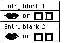 ["Cadillac"] What model year is it?
For example, enter eight-six for a 1986
model. [presses 9, then 1] What color
is the car? [says "Gray... well, more
bluish-gray"] Enter your phone number.
[presses 2-2-2-9-9-9-9] Example 8.
The conversational form style.
["Cadillac"] What model year is it?
For example, enter eight-six for a 1986
model. [presses 9, then 1] What color
is the car? [says "Gray... well, more
bluish-gray"] Enter your phone number.
[presses 2-2-2-9-9-9-9] Example 8.
The conversational form style.
One drawback of the conversational style is that a user cannot correct mistakes. The careful
style (Example 9) resembles the conversational style, but automatically reviews each
entry [Sorce, et al. 1993]. If the user confirms the value, the form continues with the
next entry blank. If the user cancels it, the form prompts the user to enter a different
value. This style was used by obsessive-compulsive psychiatric patients. They filled out
the same form once each week. Each entry blank contained a multiple choice question,
presented through a standard-with-skips style menu, described above in section 2.
What kind of car are you selling? [says 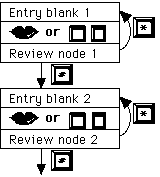 "Cadillac"] You said, "Cadillac" (plays back
recording). If that's right, press #. If not,
press *. [Presses #] What model year is it?
For example, enter eight-six for a 1986 model.
[presses 9, then 1] A 1991 model. If that's
right, press #. If not, press *. [Presses #]
What color is the car? [says "Gray... well,
more bluish-gray"] You said, "Gray... well,
more bluish-gray". If that's ^ [Presses *,
interrupting prompt] What color is the car?
[says "Bluish gray"] You said, "Bluish gray."
If that's ^ [Presses #, interrupting prompt]
...and the dialogue continues Example 9. The
careful form style.
"Cadillac"] You said, "Cadillac" (plays back
recording). If that's right, press #. If not,
press *. [Presses #] What model year is it?
For example, enter eight-six for a 1986 model.
[presses 9, then 1] A 1991 model. If that's
right, press #. If not, press *. [Presses #]
What color is the car? [says "Gray... well,
more bluish-gray"] You said, "Gray... well,
more bluish-gray". If that's ^ [Presses *,
interrupting prompt] What color is the car?
[says "Bluish gray"] You said, "Bluish gray."
If that's ^ [Presses #, interrupting prompt]
...and the dialogue continues Example 9. The
careful form style.
The user-controlled style (Example 10) gives users even more control, both over
initiation of value entry and over review of values. Users can gather their thoughts
before starting to record, and can skip entry of values they consider irrelevant. After
entering a value, the form continues automatically with the next entry blank, but the user
can choose to go back to an entry blank, review the value there, and replace it.
 Brand.  To record, press 1.  End
recording by pressing #.  For the next
entry blank, press 9.  [Presses 1]
[says "Cadillac"]  [presses #] Model
year.  To enter a value, press 1.  To
review the previous entry blank, press
7.  For the next entry blank, press 9.
[Presses 1] Enter two digits.  For
example, enter eight-six for a 1986
model.  [Presses 9, then 1] Color.  To
begin recording, press 1.  ^  [Presses
1, says "Gray, well, more bluish-gray"]
Phone number.  To enter a value, press
1.  To review the previous entry blank,
press 7.  ^  [Presses 7] Color.  "Gray,
well, more bluish-gray".  To replace
this recording, press 1.  ^  [Presses
1, says, "Bluish-gray"] Phone number.
To enter a value, press 1.  ^  [presses
1] Enter your seven-digit phone number
at any time.  [presses 2-2-2-9-9-9-9]
That's the end of the form.  If you're
satisfied with this ad and would like
to save it, press 3.  ^  [presses 3]
Example 10.  The user-controlled form
style.  The user chooses to review and
then replace the recording in the
'Color' entry blank.
recording by pressing #. For the next
entry blank, press 9. [Presses 1]
[says "Cadillac"] [presses #] Model
year. To enter a value, press 1. To
review the previous entry blank, press
7. For the next entry blank, press 9.
[Presses 1] Enter two digits. For
example, enter eight-six for a 1986
model. [Presses 9, then 1] Color. To
begin recording, press 1. ^ [Presses
1, says "Gray, well, more bluish-gray"]
Phone number. To enter a value, press
1. To review the previous entry blank,
press 7. ^ [Presses 7] Color. "Gray,
well, more bluish-gray". To replace
this recording, press 1. ^ [Presses
1, says, "Bluish-gray"] Phone number.
To enter a value, press 1. ^ [presses
1] Enter your seven-digit phone number
at any time. [presses 2-2-2-9-9-9-9]
That's the end of the form. If you're
satisfied with this ad and would like
to save it, press 3. ^ [presses 3]
Example 10. The user-controlled form
style. The user chooses to review and
then replace the recording in the
'Color' entry blank.
These three styles only hint at a larger design space. For some applications and user
populations, conversational forms may be appropriate. When the consequences of incorrect
entry are high, however, the form should permit users to review, either automatically or
upon user request. If some of the entry blanks are optional, or user initiation is
desirable, the user controlled style or a variation on it may be the most suitable choice.
Sometimes, none of these three styles will be quite right. For example, if the
consequences of incorrect entries are very high, it may be appropriate to have explicit
initiation of value entry, as in the user-controlled style, but still automatically review
each value, as in the careful style.
We can gain more insight into the style variations by exploring the design dimensions
associated with recombining dialogue parts. The recordings in a form divide naturally into
a header, a footer, entry blanks, and review nodes associated with entry blanks. For
example, the first entry blank in Example 9 (the careful style) stated, "What kind of
car are you selling?" After the user recorded, "Cadillac," the review node
stated, "You said, `Cadillac'. If that's right, press #. If not, press *." To
conserve space, the examples omitted the headers and, where possible, the footers; they
function analogously to their counterparts in menus. Figure 13 presents a design space for
audio forms. Below we describe each of the possible choices along the design dimensions,
and discuss their effects on usability.
Parts: header; entry blanks; optional review nodes; footer
Design Dimension     Possible Values
Movement actions     repeat next, previous entry blank next or
                     previous empty or filled entry blank goto
State change         add value to entry blank delete value (one
actions              or all) from entry blank replace value (=
                     delete + add) save, cancel form
Action combinations  add value and go to review node add value
                     and go to next entry blank cancel entry:
                     return (from review node) and delete value
User inaction        Any movement, state change or combination
effect               action
Figure 13: A design space for form styles.
Design Dimension    conversational  careful        user controlled
Movement actions    --              next entry     next, previous
                                    blank (from    entry blank
                                    review node)
State change        --              --             --
actions
Action              --              cancel last    add value +
combinations                        entry (from
go to next
                                    review node)   replace value
                                                   + go to next
User inaction       add value +        add value +       repeat
effect
go to next;
go to next;
                    save form          save form

(in footer)    (in footer)
Figure 14: The conversational, careful, and user-controlled styles in the design
space. Because all three styles combine state change (e.g., adding a value) with movement,
the second row is empty. Other styles may provide separate state change actions,
especially deleting a value in the current entry blank.
The possible transitions for movement among the entry blanks are analogous to those for
movement among items in a menu. Since users will typically enter information in most or
all the entry blanks, movement forward and back by one entry blank are appropriate
movement commands. From a review node, a user can return to the associated entry blank or
transition to the next one. The backward movement action is one factor that influences a
user's ability to review, especially if there are no review nodes. In the user-controlled
style, it allows review of values at the user's discretion, by explicitly moving
backwards.
All form styles need some way to add a new value to an entry blank. Some styles may
include a delete action as well, to remove a value from an entry blank. It is
theoretically possible for an absolute mechanism to initiate value entry or removal: from
anywhere in the form, a user could initiate addition of a value to any of the entry
blanks. All the form styles in this paper, however, use positional initiation: insertion
and deletion actions apply to the current entry blank.
Actions that perform more than one value change are also possible. For example, a
replace action performs a delete followed by an insert. When an entry blank contains
several values (e.g., several dates or several phone numbers) a delete-all action can
remove them all.
After editing the contents of a form, a user can choose either to save it or to cancel
it, thus discarding the changes made. In the examples above, the save and cancel actions
were available only from the footer. Other styles may allow save and cancel from anywhere
in the form.
From the user's perspective it is often useful to combine the add-value action with a
movement to the review node or the next entry blank. From the system's perspective, this
implies that after initiation of value entry the form passes control to a subroutine. The
subroutine may allow the user to record, enter a sequence of touch-tones (e.g., a date) or
select from a menu. When the value entry subroutine returns, the form follows the bundled
movement action. For example, the conversational and user controlled styles move to the
next entry blank while the careful style moves to a review node. From the review node, a
user can erase the value and return to the current entry blank (canceling the value
entered), or go on to the next entry blank.
Of course, it is not necessary to bundle the insertion action with a movement in this
way. After returning from the value entry subroutine, the system could replay the contents
of the current entry blank. This may be appropriate either as an alternative mechanism for
reviewing the contents of the current entry blank, or to encourage the addition of several
values to the entry blank.
Other composite actions may also be included. For example, an undo command first moves
to the previous entry blank, and then deletes a value there. Similarly, from a review
node, the undo command would return to the current entry blank and erase the value just
entered.
A timeout in an entry blank often initiates entry of a new value. This choice may have
the single largest effect on the feel of the form. Explicit initiation of value entry
gives users control over the pace of the interaction, allowing them to gather their
thoughts before entering information. On the other hand, timeout initiation can make the
dialogue flow naturally for novice users, as suggested in DC4 (Timeout movement a crutch).
When value insertion is the only action available from an entry blank, it can be
initiated by default, even if the user does not wait for the timeout at the end of the
entry blank. For example, in an entry blank that expects input of data by touch-tones, the
careful style interprets any user input as data rather than commands.
From a review node, timeouts can initiate any of the possible actions. For example, in
the careful style, callers must either explicitly erase the value and return to the
current entry blank, or confirm it and go on to the next entry blank. If the user does
neither, the system repeats the prompt. An alternative version would treat silence as
assent (timeout moves ahead to the next entry blank) or dissent (timeout erases the value
and returns to the current entry blank).
As in menus, it is useful to apply the subdivision idea recursively, in this case to
entry blanks. Three kinds of information can appear in an entry blank: a description of
the desired values, current values (e.g., recordings), and prompts for actions. The
subdivision opens additional design choices for movement within an entry blank and for
value change actions that are sensitive to the current position within the entry blank.
Figure 15 summarizes the design space for entry blanks. The subdivision also focuses
attention on how to word prompts for the desired values.
All three styles presented above treated each entry blank as if it were a single part:
timeouts advance through the subparts and value change actions are not position sensitive.
Almost any choice of entry blank styles, however, could be built into any style in the
form design space.
Parts: field name; description of desired value;
current values; prompts for actions
Design Dimension    Possible Values              Standard Values
Movement actions    next part, previous part,       --

jump to prompts for
                    actions
State change        inherited from overall       not position
actions             form style: position         sensitive
                    sensitive or not?
Action              inherited from overall
combinations        form style
User inaction       Any movement or state        next part
effect              change action
Figure 15: A design space for entry blank styles.
Just as with menu items, user initiated movement between the parts of an entry blank
may be useful. For example, analogous to the fast-standard menu style, an explicit help
command could skip over the current values and go directly to the prompts for action. Or,
a skip action might move to the next value within the entry blank.
Perhaps more interestingly, subdivision of the entry blank permits the value change
actions to be position-sensitive. This can be particularly valuable when entry blanks can
include multiple values. Consider an entry blank that has several dates, each entered by
touch-tones. An absolute deletion command would always remove the last date. A positional
deletion action would remove the date currently being played. Likewise, the user could
insert an additional date just before the current one. As with any position-sensitive
action, there may be a moving target problem (DC5) if position-sensitive deletion is
combined with timeout advances. The user may expect the current date to be deleted but
press the button slightly too late and find that the next one has been deleted.
The same idea applies to entry blanks that contain recorded voice. Positional insertion
and deletion are especially useful in dictation applications. With positional insertion,
when a user inserts a new recording the computer splits the recording then playing into
two segments and inserts the new recording in the middle. Similarly, a positional deletion
action could remove the voice segment currently playing back. An even more complex
positional deletion action would require the user to mark the beginning and end of the
voice portion to delete. Even in fairly complex dictation applications, however, the
simpler mechanism of deleting the entire voice segment currently playing might work quite
well.
As usual, the prompt wording style has a large impact on the sound and feel. The
descriptions of desired values can be descriptive (e.g., "The color of your
car"), interrogative (e.g., "What color is your car?") or commanding
("Record the color of your car"). DC8 (statements -> passivity) suggests that
the choice of timeouts or explicit initiation of actions interacts with the choice of
wording styles for these descriptions. In informal tests, we found command statements to
be less effective with explicit initiation of value entry. When entering dates, users
often forgot to press 1 to initiate data entry. They entered several touch-tones (e.g.,
0-7-3-1 for July 31), which the system interpreted as explicit user actions rather than as
entry of a date. On the other hand, we would expect descriptive statements to be less
effective with timeout initiation of value entry, because users might not know that the
computer was waiting for input.
Two more styles illustrate two of the possible entry blank styles. The event-calendar
style [Resnick 1993] is based on the user controlled style but treats individual entry
blanks differently. This style allows people to add new event announcements to a public
bulletin board. Callers fill out forms with entry blanks for a headline, date, time,
location, sponsor, contact phone number, and details. The style has evolved over the more
than two and a half years that the application has been used by the general public.
The event-calendar allows multiple values in each entry blank. Multiple values are
useful for dates and for appending additional thoughts in the 'details' entry blank. The
delete action removes only the last date if an entry blank contains more than one. It
removes all the voice in the entry blank, however, not just the last segment recorded,
because informal tests indicated that was confusing for novices. In Example 11, the user,
who is filling in a form for a classified ad, enters two telephone numbers.
....
Phone number. The number people should call if they want to buy your car. To enter a
value, press 1. ^
[presses 1]
Enter your seven-digit phone number at any time.
[presses 2-2-2-9-9-9-9]
That's the end of the form. ^
[presses 7]
Phone number. 222-9999. To enter an additional value, press 1. ^
[presses 1]
Enter your seven-digit phone number at any time.
[presses 3-3-3-8-8-8-8]
That's the end of the form. ^
[presses 7]
Phone number. 222-9999; 333-8888. To enter an additional value, press 1. ^
...
Example 11. Part of a sample dialogue with the event-calendar style. The user enters
two phone numbers in the last field of the form, then reviews it to make sure they are
there. Note that in this style, the entry blank initially has a long description
("The number people should call..."). It disappears once the user has entered a
value.
Form parts: header; entry blanks; footer; no review nodes
Design Dimension     Event-calendar            dictation
Movement actions     next, previous entry      next, previous
                     blank                     entry blank
State change                                   add value delete
actions                                        value
Action combinations  add value + go to next    --
                     replace value + go to
                     next
User inaction        repeat entry blank        repeat entry blank
effect
Figure 16: Event-calendar and dictation form styles. The event-calendar is
identical to the user controlled style presented earlier.
Entry blank parts: field name; description of desired value;
current values; prompts for actions
Design Dimension    Event-calendar          dictation
Movement actions    --                      next part, previous
                                            part
State change        add at end delete       add at current
actions             last value (all         position delete
                    values for voice        current value
                    entry blanks)
Action              --                      --
combinations
User inaction       next part of entry      next part of entry
effect              blank                   blank
Figure 17: The event-calendar and dictation entry blank styles.
The dictation entry blank style also permits multiple values in entry blanks but
it employs positional insertion and deletion actions. Whereas the event-calendar style
permitted users only to append to the end of the entry blank, the dictation style allows
insertion of a new value anywhere in an entry blank. Users can skip back and forth between
the values in an entry blank, to quickly locate the desired insertion position. To
encourage people to edit individual entry blanks, the dictation form style does not
advance to the next entry blank after a user enters a new value. We expect this style to
be most useful in voice dictation applications. A user can insert an additional sentence
or paragraph without re-recording everything that follows.
Description. Any other information about your car. To enter a value, press 1.
[Presses 1, says "I am the original owner of this car. You have to see it to
appreciate it."]
For the next entry blank, press 9. To record more, press 1. To erase, press 2. To
review this entry blank, buttons 4 and 6 move back and forth between your recordings.
[Presses 4]
I am the original owner of this car. ^
[Presses 1, interrupting, says, "It's been garaged and lovingly
maintained."]
You have to see it to ^
[Presses 4 twice]
I am the original owner of this car. It's been garaged and lovingly maintained. You
have to see it to appreciate it.
...
Example 12. The dictation entry blank style. Here, the user inserts an additional
sentence in the middle of the entry blank, by locating the desired position and then
pressing 1.
The primary design space for forms treats a header, entry blanks, review nodes, and a
footer as the primitive components. Subdivision of the entry blanks yielded additional
options for movement within entry blanks and for position sensitive insertion and deletion
actions. Five complete styles illustrated points in the design spaces.
There have been no controlled comparisons of form styles in the literature, and we do
not report any in this article, but it seems likely that the appropriate style choice
depends on the tasks and levels of user experience. The styles that include more actions,
simple rather than composite actions, and make less use of timeouts afford greater user
control. Such styles also demand greater user control, however, which may be difficult for
novice users.
Menus, lists, and forms are important dialogue structures in telephone-based
interactive voice response applications. One menu style and one form style dominate the
commercial marketplace currently. While these styles are fairly easy for novices to learn,
they are limiting because the locus of control rests with the machine rather than the
user.
Fortunately, many other interaction styles are possible. This article has presented
twelve menu styles and five form styles, including all the interesting styles reported in
the literature. The design spaces used to describe these alternatives can also be used to
generate new styles. We had not considered all the styles presented in this paper until we
had constructed the dimensions of the design space.
With so many styles to choose from, and the possibility of generating custom styles,
the designer can tailor the choice to the needs of particular applications, just as
screen-based interface designers choose menu styles (e.g., pull down, pop up, radio
buttons) to match particular needs. For example, if users will frequently browse among
large collections of options, it will be worth their initial effort to learn the commands
for movement among options in menus. If some frequent users will memorize the contents of
menus, numeric selection may be best. If some entry blanks in a form are optional or if
users will need time to gather their thoughts before recording, a form style with explicit
commands to initiate value entry may be appropriate. Rather than relying on these summary
guidelines, however, we encourage designers to describe their expected users and apply the
design considerations of section 3 to a range of possible styles.
A case study of a design effort employing one of these new interaction techniques
appears in [Virzi and Sorce 1994]. The authors report on the design of an IVR system for a
large customer service center. Most of the caller base was expected to have infrequent
contact with the system (one or two calls per year). However, a small but important subset
of the population does call in frequently (several times per month) and expects to be able
to get information from the system quickly. To meet the conflicting needs of these two
user profiles, they chose to build the system using the standard-with-skips style of menu.
Infrequent callers pay a slight penalty in being forced to listen to the instructions on
skipping. These instructions are played in the header of each menu. More frequent callers,
however, are encouraged to learn this advanced feature of the system. An absolute
selection scheme was chosen to benefit the experienced caller base as well. The
experienced user can jump directly to the option desired.
Preliminary analysis of call records shows that of the callers who use the IVR system
(i.e., those who do not immediately request a human operator) approximately 25% use the
skip key. Use of the skip key has increased over time and is higher among frequent
callers. Moreover, as the length of the system prompt increases, the use of the skip key
increases as well. In one part of the system, where individual prompts in a long list may
be up to 25 seconds, over 80% of the callers use the skip key.
While the characteristics of particular applications and user populations are
important, designers should not ignore the value of standardization. Users can transfer
mechanism knowledge, such as how to select from menus, if dialog styles are common across
applications. The advantages of a new style need to outweigh the costs of incompatibility
with the styles we labeled standard menus and conversational forms. One reason for
choosing the standard-with-skips style for the service center application above was that
users unfamiliar with the new style can interact with it just as they would standard
menus. As styles that give users greater control become prevalent, however, the
presumption in favor of today's popular styles should wane.
The design spaces presented here have broad implications beyond telephone-based
interfaces. Audio interactions with workstations and personal digital assistants will be
useful whenever the users' eyes are busy with other tasks. Moreover, much of the analysis
in this article carries over to any interface that is temporal in nature, even if it is
not audio. In general, if a device can only present a small part of the relevant
information at one time, then all the fundamental audio design choices will be relevant:
what information to include in menu options and form entry blanks, how users can navigate
among the pieces of information, and which actions to initiate with timeouts versus
explicit commands.
Consider, for example, the new generation of ADSI-compatible display phones [Bellcore
1992]. While the displays come in many sizes, typically they are 20 characters wide and
eight lines long. There is a signaling protocol that allows these phones to receive 160
character batches during normal voice calls. One natural idea is to augment interactive
voice response services with a presentation of menus on the screen. If one option is
displayed on each line, it may be possible to display the entire menu at once, but 20
characters per menu option leads to cryptic descriptions of the options. Another
possibility would be to display one option at a time, using the full screen space to give
a clearer description of the option. Since only one option at a time will be displayed,
many of the audio menu style variables apply, including how users move through the options
and make selections.
Similar design considerations apply to other small-screen devices, such as the screen
employed in in-flight telephony services [Karis, et al. 1993] or a palmtop virtual reality
system [Fitzmaurice, et al. 1993]. These authors point out the difficulty in presenting
the necessary information in a limited screen space. Analogs of the menu and form styles
presented in this paper may apply to such devices.
The temporal presentation of audio creates interesting design challenges. Exploration
of techniques that give users control over the time dimension are just beginning. The
essence of that exploration is to break information chunks into ever smaller parts and
find natural ways for users to control which part will be presented next. The design
spaces in this article have applied that principle to both menus and forms. The division
of menus and forms into component parts, and those parts into even smaller parts, opens up
new possibilities. It may be that the best styles have not yet been invented.
Arons, B. 1992. Techniques and Applications of Time-Compressed Speech. In AVIOS '92:
Conference of the American Voice Input/Output Society, Minneapolis, MN.
Arons, B. 1993. SpeechSkimmer: Interactively Skimming Recorded Speech. In UIST '93:
Symposium on User Interface Software and Technology, 187-196.
Bellcore 1992. Generic Requirements for an SPCS to Customer Premises Equipment Data
Interface of Analog Display Services Technical Advisory TA-NWT-001273.
Card, S. 1982. User Perceptual Machanisms in the Search of Computer Command Menus. In CHI
'82: Human Factors in Computing Systems, 190-196.
Davis, J. R. 1991. Let Your Fingers Do the Spelling: Disambiguating Words Spelled with
the Telephone Keypad. Journal of the American Voice I/O Society 9, March, 57-66.
Degen, L., Mander, R. and Salomon, G. 1992. Working with Audio: Integrating Personal
Tape Recorders and Desktop Computers. In CHI '92 Conference on Human Factors in
Computing Systems, 413-418.
Detweiler, M., Schumacher, R., Jr. and Gattuso, N., Jr. 1990. Alphabetic input on a
Telephone Keypad. In the Human Factors Society-- 34th annual meeting.
Engelbeck, G. and Roberts, T. 1990. The Effects of Several Voice-Menu Characteristics
on Menu Selection Performance Technical Report ST0401. US West Advanced Technologies.
Fast, L. and Ballantine, R. 1988. Dialing a name: Alphabetic Entry Through a Telephone
Keypad. SIGCHI Bulletin 20, 2, 34.
Fay, D. 1994. User Acceptance of Automatic Speech Recognition in Telephone Services. In
International Conference on Spoken Language Processing, Yokohama, Japan, .
Fitzmaurice, G. W., Zhai, S. and Chignell, M. H. 1993. Virtual Reality for Palmtop
Computers. ACM Transactions on Information Systems 11, 3, 197-218.
Gould, J. D. and Boies, S. J. 1983. Human Factors Challenges in Creating a Pricipal
Support Office System: The Speech Filing System Approach. ACM Transactions on Office
Information Systems. 1, 3, 273-298.
Halstead-Nussloch, R. 1989. The Design of Phone-Based Interfaces for Consumers. In CHI
'89 Conference on Human Factors in Computing Systems, Austin, TX, 347-352.
Hindus, D. and Schmandt, C. 1993. Ubiquitous Audio: Capturing Spontaneous
Collaboration. ACM Transactions on Information Systems, 11, 4, 376-400
Hornstein, T. 1994. Telephone Voice Interfaces on the Cheap . UBILAB report, Union Bank
of Switzerland, Bahnhofstr. 45, CH-8021 Zurich.
Karis, D., Norton, S. and Dobroth, K. 1993. User-interface Design for an In-flight
Telecommunications Service. In Human Factors in Telecommunications, Heidleberg,
Germany, 51-62.
Kato, Y. and Hosoya, K. 1993. Message Browsing Facility for Voice Bulletin Board
Service. In Human Factors in Telecommunications, Heidelberg, Germany, 321-330.
Kiger, J. L. 1984. The Depth/Breadth Trade-off in the Design of Menu-Driven User
Interfaces. International Journal of Man-Machine Studies 20, 2, 201-213.
Kondziela, J. M. 1990. Radio-Analogue Method of Audio Presentation and Control for
Audiotex Services US Patent 4,899,369.
Landauer, T. K. and Nachbar, D. W. 1985. Selection from Alphabetic and Numeric Menu
Trees Using a Touch Screen: Breadth, Depth, and Width. In CHI '85 Conference on Human
Factors in Computing Systems, 73-78.
Lee, E. and MacGregor, J. 1985. Minimizing User Search Time in Menu Retrieval Systems. Human
Factors 27, 157-162.
MacGregor, J., Lee, E. and Lam, N. 1986. Optimizing the Structure of Database Menu
Indexes: a Decision Model of Menu Search. Human Factors 28, 4, 387-399.
Marics, M. 1990. How Do You Enter "D'Anzi-Quist" Using a Telephone Keypad? In
the Human Factors Society-- 34th annual meeting.
Miller, D. P. 1981. The Depth/Breadth Tradeoff in Hierarchical Computer Menus. In Human
Factors Society 25th annual meeting, 296-300.
Norman, K. L. 1991. The Psychology of Menu Selection: Designing Cognitive Control of
the Human/Computer Interface. Ablex, Norwood, NJ.
Paap, K. R. and Roske-Hofstrand, R. J. 1986. The Optimal Number of Menu Options per
Panel. Human Factors 28, 4, 377-385.
Pierce, B. J., Parkinson, S. R. and Sisson, N. 1992. Effects of Semantic Similarity,
Omission Probability and Number of Alternatives in Computer Menu Search. International
Journal of Man-Machine Studies 37, 653-677.
Resnick, P. 1993. Phone-Based CSCW: Tools and Trials. ACM Transactions on
Information Systems 11, 4, 401-424.
Resnick, P. and Virzi, R. A. 1992. Skip and Scan: Cleaning Up Telephone Interfaces. In CHI
'92: Conference on Human Factors in Computing Systems, Monterey, CA, 419-426.
Roberts, T. L. and Engelbeck, G. 1989. The Effects of Device Technology on the
Usability of Advanced Telephone Functions. In CHI '89 Conference on Human Factors in
Computing Systems, 331-337.
Rosson, M. B. and Mellen, N. M. 1985. Behavioral Issues in Speech-Based Remote
Information Retrieval. In AVIOS, San Francisco, CA, .
Schmandt, C. 1994. Voice Communication with Computers. Van Nostrand Rheinhold,
New York.
Schmandt, C. and Arons, B. 1984. A Conversational Telephone Messaging System. IEEE
Transactions on Consumer ElectronicsIEEE Transactions on Consumer Electronics. CE-30,
3, 21-24.
Sorce, J. F., Baer, L., Henriques, A. and Brown-Beasley, M. 1993. Applying Interactive
Voice Response Technology in Psychiatric Practice. In Human Factors in
Telecommunications, Heidelberg, Germany, 397-407.
Stifelman, L. J., Arons, B., Schmandt, C. and Hulteen, E. A. 1993. VoiceNotes: A Speech
Interface for a Hand-Held Voice Notetaker. In INTERCHI '93 Conference on Human Factors
in Computing Systems, 179-186.
Virzi, R. and Sorce, J. 1994. In Usability in Practice, M. Wicklund, Eds.
Academic Press, Cambridge, MA, 559-589.
Virzi, R. A., Resnick, P. and Ottens, D. 1992. Skip and Scan Telephone Menus: User
Performance as a Function of Experience. In Proceedings of the Human Factors Society,
211-215.